Project
VFL
Valorant Fantasy League
Recruit your favorite players. Field your own team. Show the league that you’ve got it.
Valorant Fantasy League allows you to assemble the best esports team you can muster, and compete against the community to show that you have the knowledge it takes to win.
We used a lean design methdology as an education tool of how to take the beta design of the VFL to the next level.
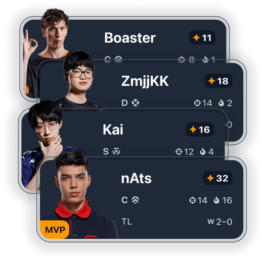
Spark
We love the idea of the VFL. When the creator-led team launched it's beta we were more than thrilled.
We'd been wanting to build a Valorant product for years, so when we saw the obvious opportunities the VFL presented we knew we had to use it as an educational project at the very least.
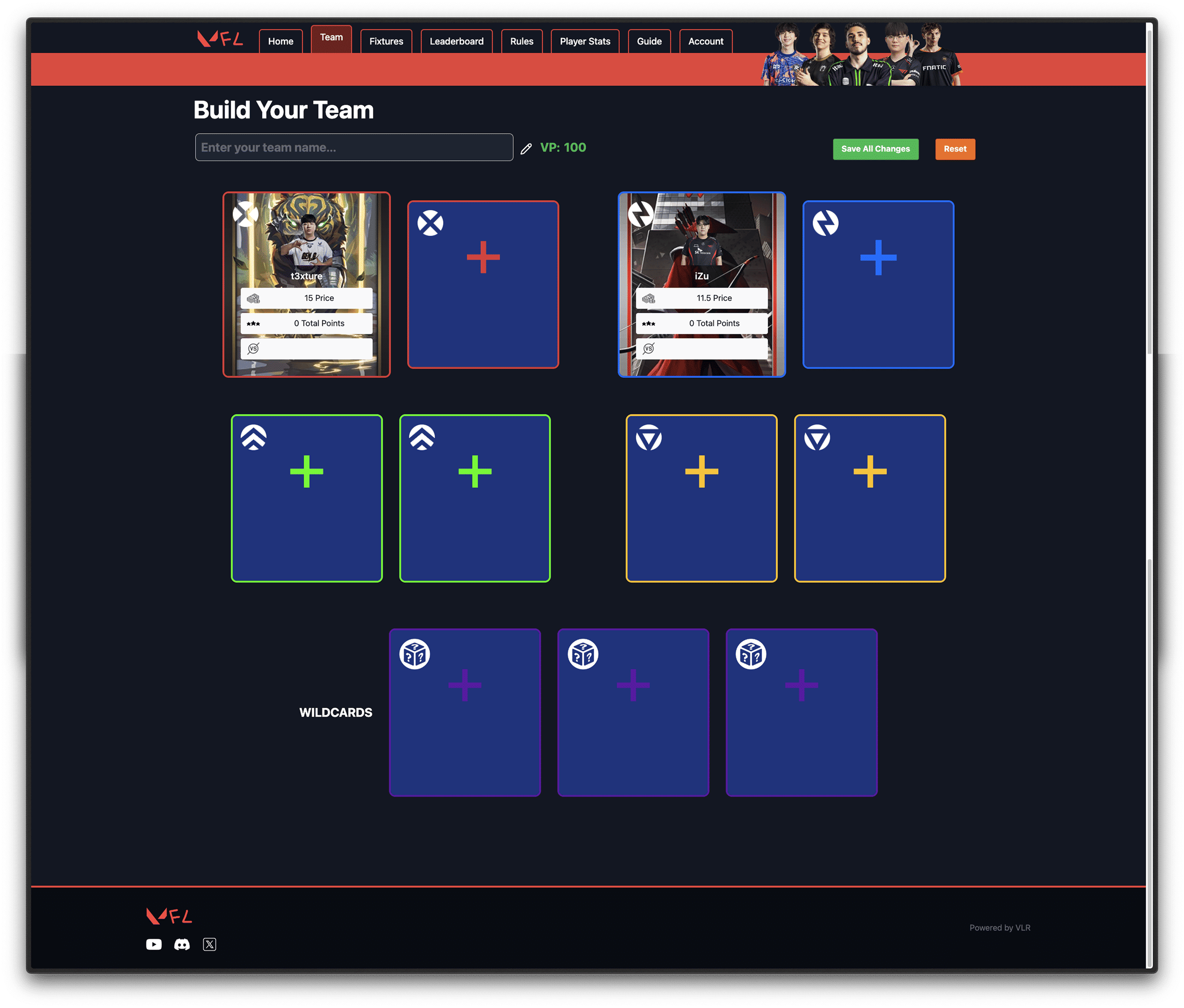
I documented a VFL Beta walkthrough for the purpose of future reference.
We are passionate about helping people find their creativity while building cool things. The VFL seemed like the perfect opportunity to bring our joy for design to the community. So we dove in. Two days after the beta launch—and completely unaffiliated with the developer— we started reimagining what the VFL could be.
Exploration
Observations
We always start by looking at the existing product. We used an exercise we call "observations and opportunitites" to start to immerse ourselves in the user's experience.
During this process we put aside all problem solving. Our goal is to understand what is there without judgement.
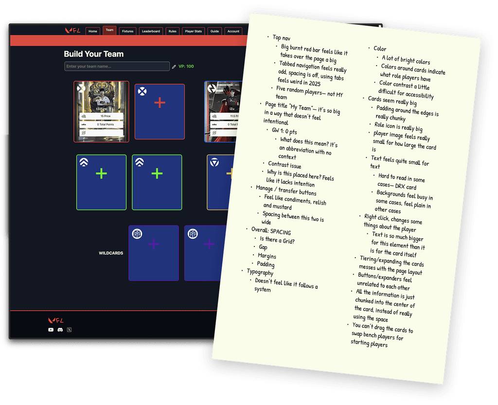
Our overall sentiment: enthusiasm.
One of the aspects that had us so excited was that we could tell that the VFL development team was clearly focused on delivering working software, and what they had built was an incredibly strong base that we could design from.
Competitive research
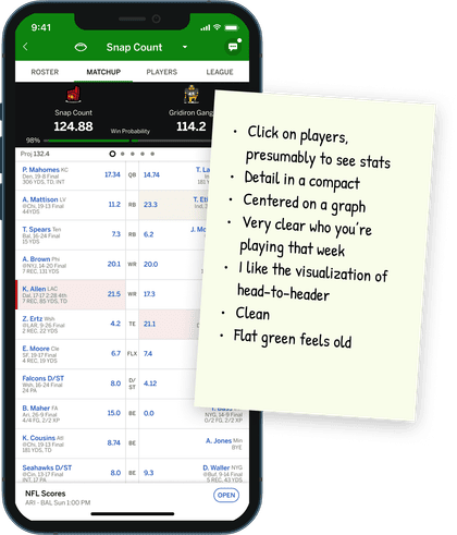
After examining the core product we turned our focus outward and applied the same exercise to other products in the space.
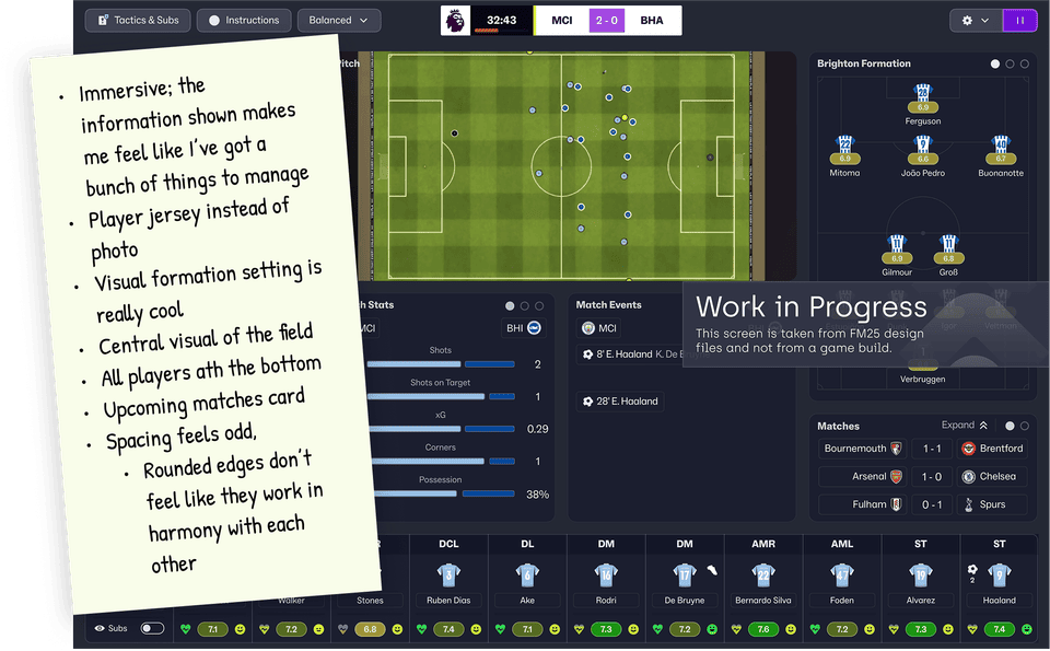
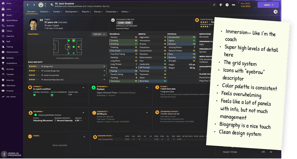
Opportunities
With a fistful of overservations we set our focus by identifying the big opportunities we wanted to capitalize one: 1. Immersion, 2. Ease-of-use and 3. A unique experience.

Core experience
Sketches
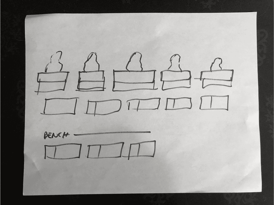
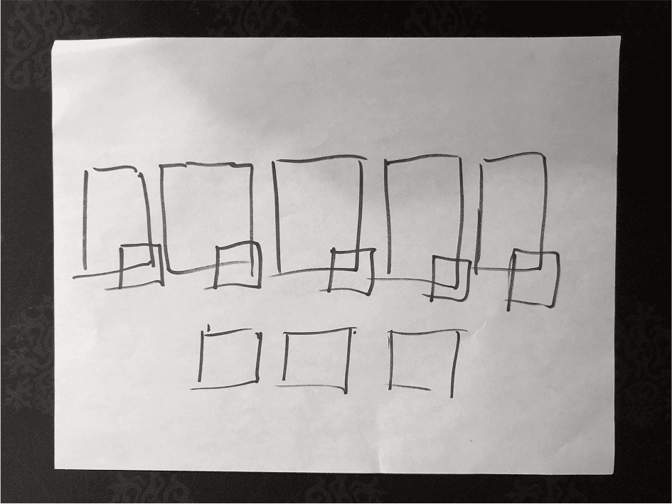
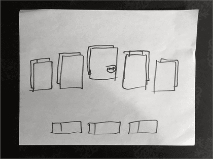
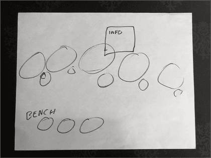
We came out of observations and opportunities hot with ideas, which we captured fast and rough.
Wireframes
We identified the top ideas from the sketches we wanted to pursue and roughed them both out.
The first would focus on a system redesign to make the Top Frag role more significant as a way to create more immersion, and the second would focus on a player tag-team idea inspired by Mortal Kombat gameplay.
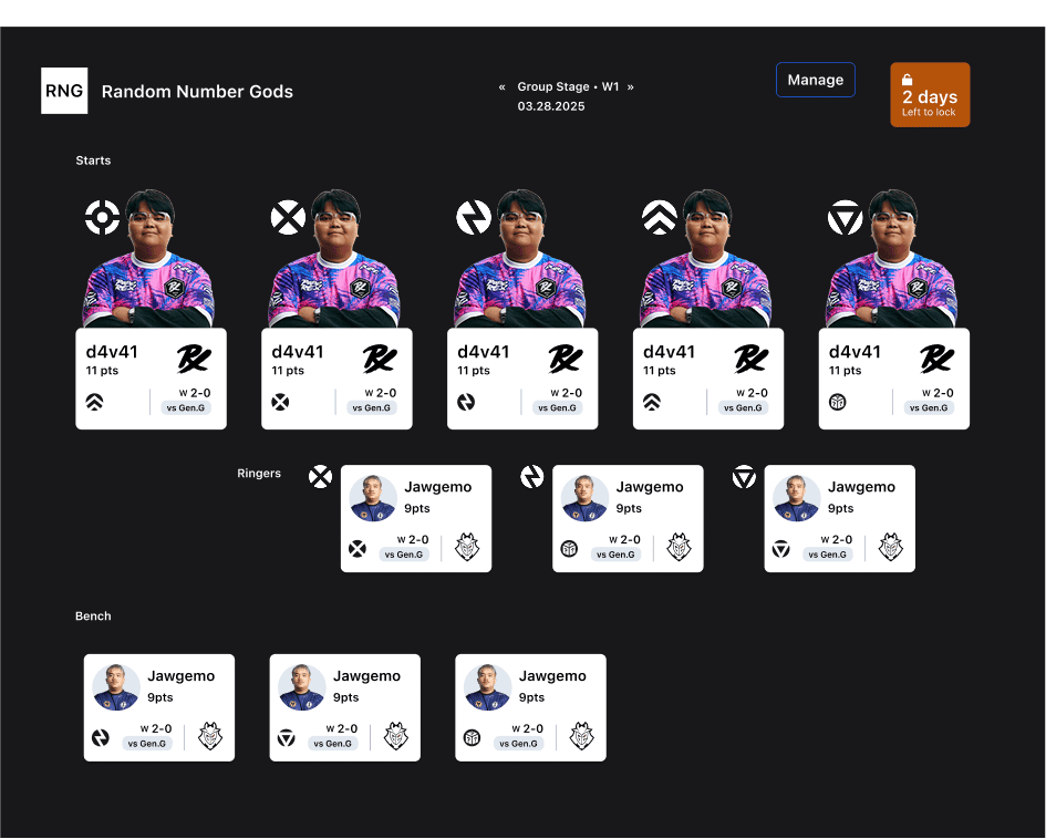
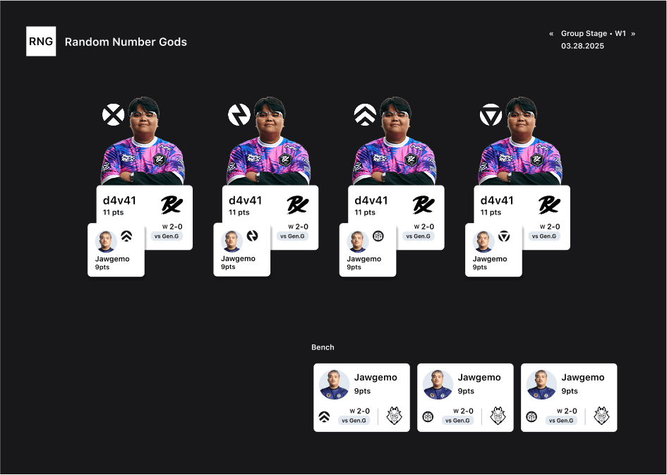
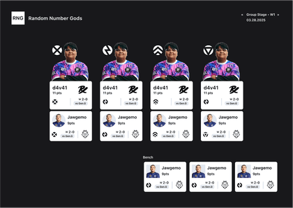
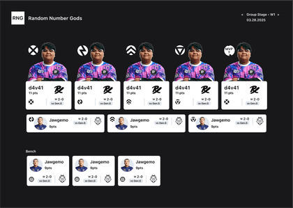
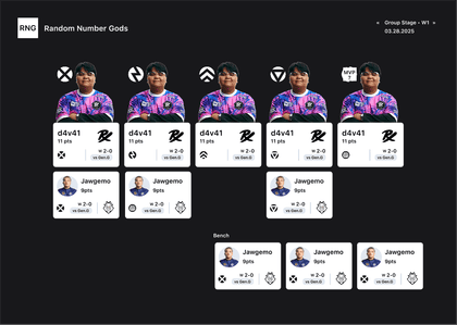
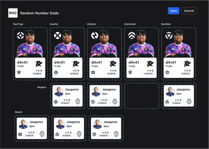
There was still a lot to iron out, but sometimes you need to know where you are going before you work out the details on how to get there, so we decided to make our ideas more visual and come back to the details later.
Visual concepts
With some rough wireframes implemented, we decided to diverge farther into visual territory.
While there was potential to spend much more time in the wireframing and core UX stage, we knew that in order to bring excitement and vision to this project we'd need to get some great visuals. We built three.
Concept 1 "Hacker"
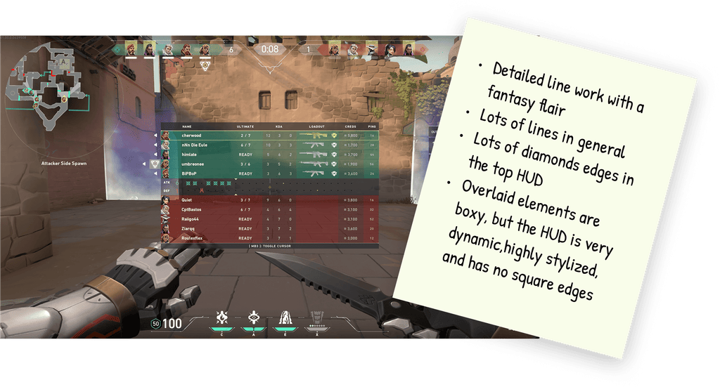
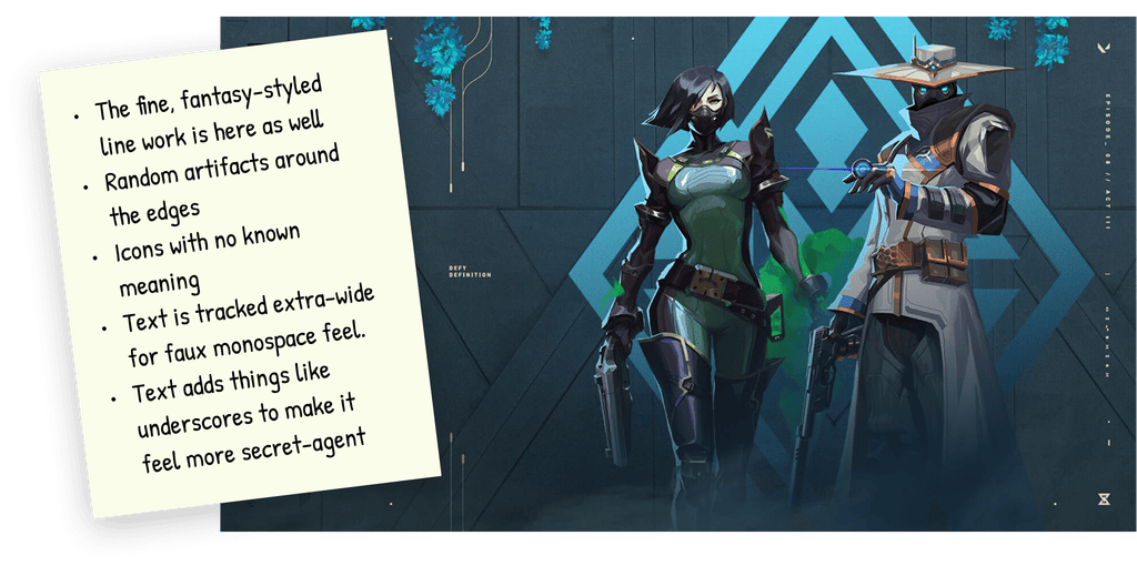
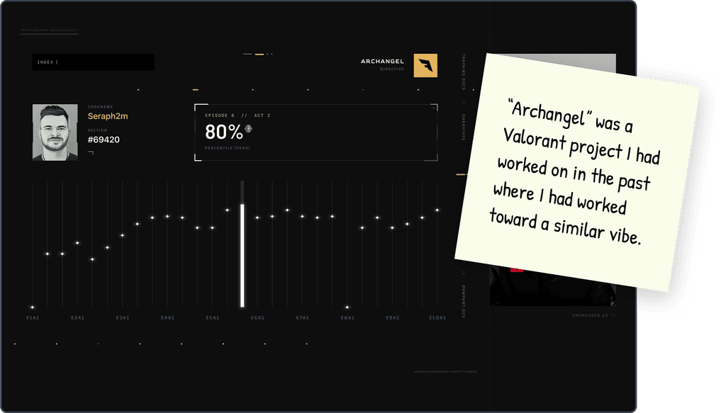
From a visual aspect, "Hacker" concept capitalizes on the in-game and media experience of Valorant.
- Digital artifacts around the edges of the design playing off motifs from Valorant brand.
- Faux "monospaced" typography, slashes and underscores to give it a digital feel.
- Broken lines carried over as a core design element from the in-game UI and marketing materials.
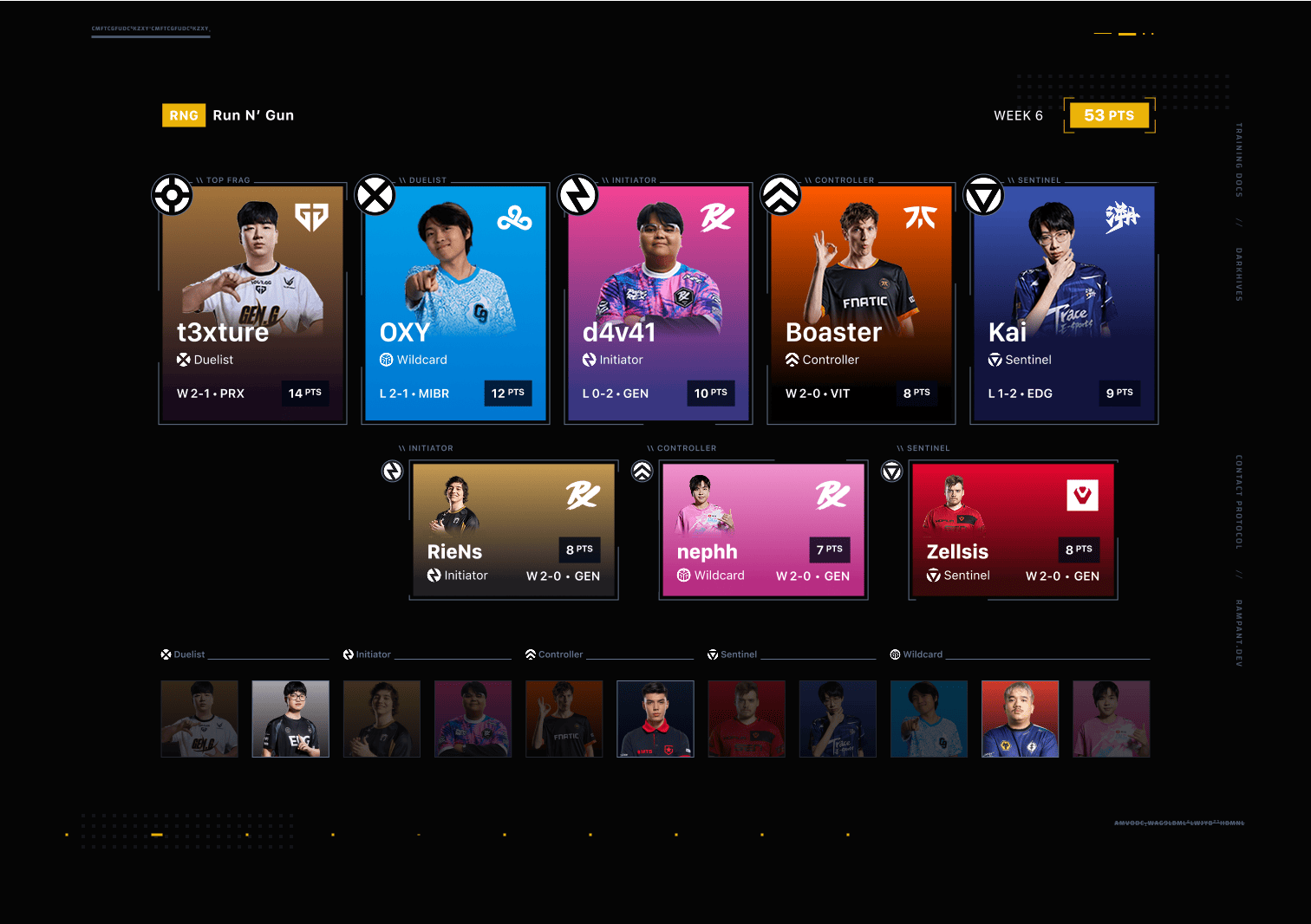
From a user perspectice, player cards were the obvious opportunity for innovation. We focused on making them the center of the experience.
- The card layout is focused on the player in a style reminiscent of baseball cards.
- Players rise from the mist of their team's colors, with the team logo in the top right.
- Player names overlay their images slightly to create a dynamic feel.
- Role logos are in the top left, along with eyebrow text clarifyiing their meaning.
- Key data points inhabit the bottom left and right corners of the card.
- The card receives different formats for secondary players and subs.
Concept 1 also explores changing the "IGL" designation into a "Top Frag" role.
Concept 2 "Allstar"
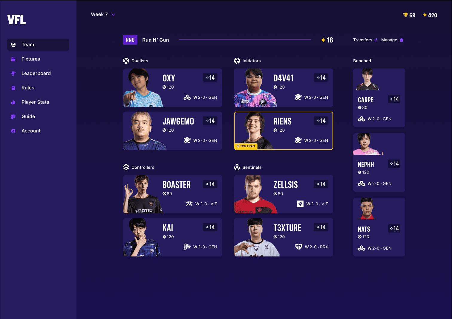
With our second concept, the goal was to take inspiration from more traditional sports apps.
While many elements are the same as our first concept, the result has a much more energetic and intuitive feel.
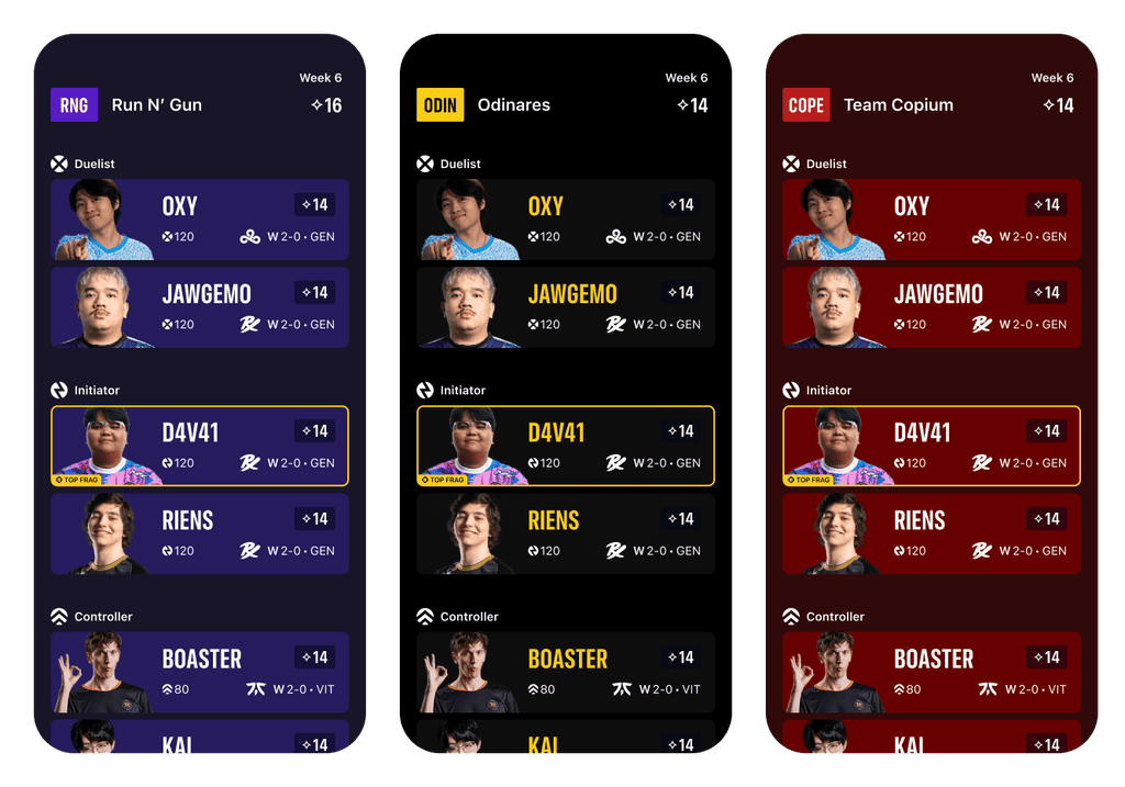
Our first concept had been rather intricate and we wanted to make sure we wouldn't have problems in a responsive context, so we built a mobile version to start to understand how this would work on smaller screens.
We also used this opportunity to explore being able to set your team colors, and have those apply to your app experience.
Concept 3 "Vital"
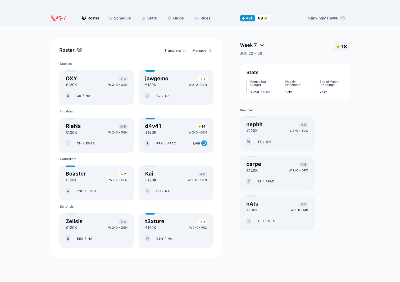
The third and final visual concept was as far away from the others as could be.
Our approach to immersion for "Vital" was to take clues from traditional fantasy apps to create a version focused on the data. We got rid of most visuals and relied instead on the raw information
New opportunities to make the player feel like they were in the coaches seat emerged: weekly scorecards and a clipboard-like interface hinted at the role a coach plays.
The vastly differing approaches from the three distinct concepts left us with a lot of ideas to capitalize on.
Visionary prototype
With a variety of ideas under our belt, we combined the best into a single unified concept that set our directional vision for the VFL. We showed our thinking through three screens: Weekly Summary, Set Roster, and Standings.
For a more detailed breakdown check out our Youtube video where we go through the decision making process. We also have a playlist if you're interested in following along with the process from the beginning.
Weekly scorecard
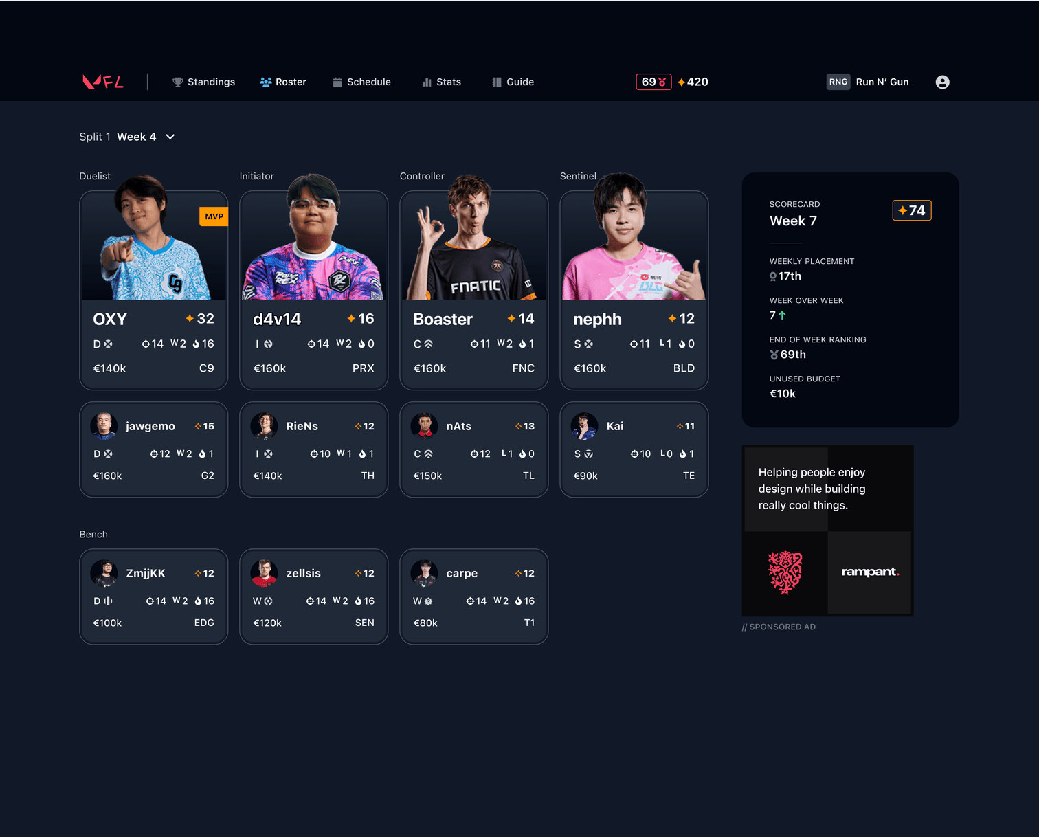
The Weekly Summary gives a detailed breakdown of your performance from the past week.
The weekly scorecard capitalized on our prior work.
- Heroic presentation of scoring players.
- Concise and key details on each version of the player card.
- A weekly scorecard summarizing your performance; the stats here are for placement only, but indicates direction.
- Ad space to pay for servers and make the devs some beer and coffee money.

A look at the organizaton of the player component.
Set roster
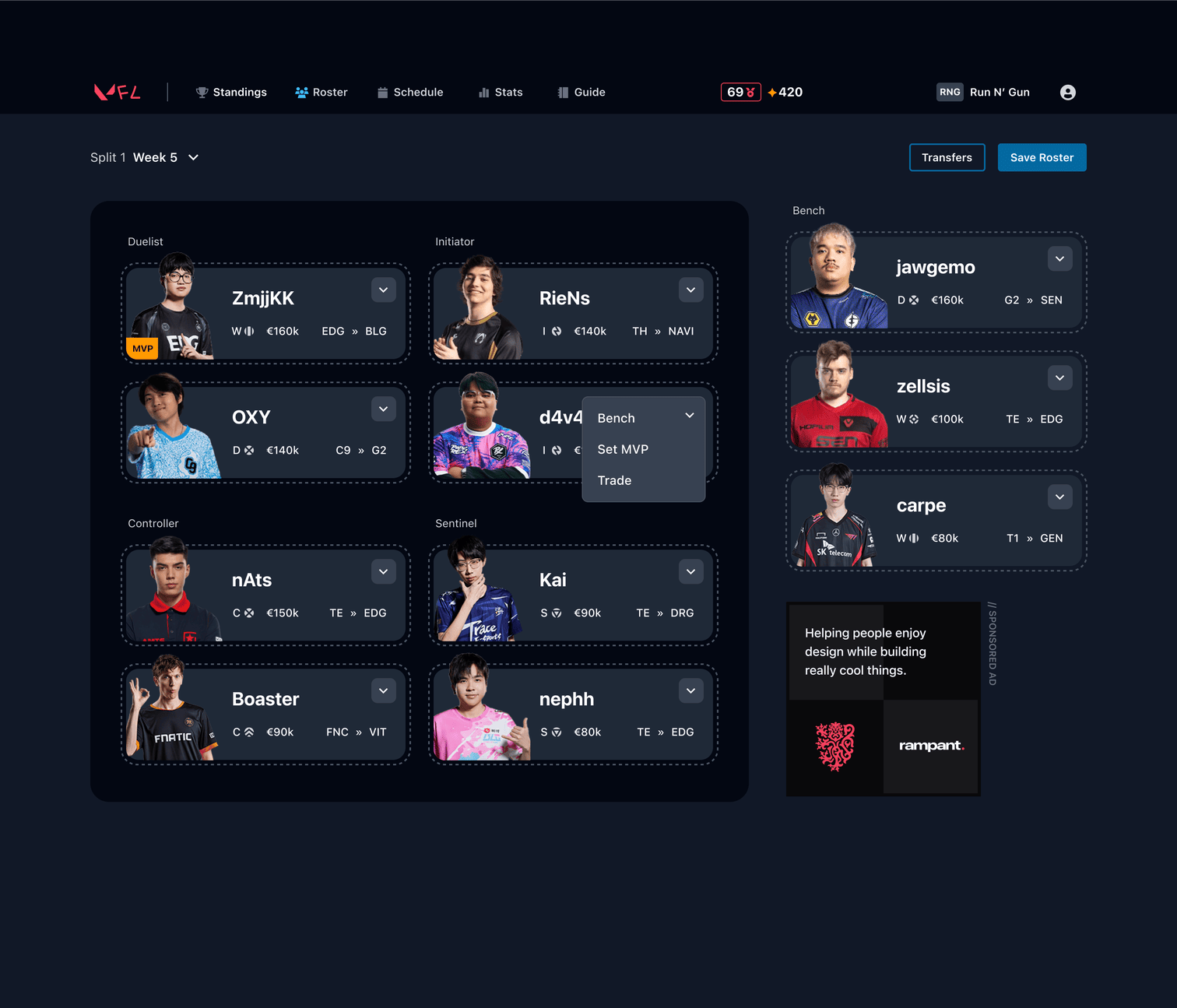
Setting your roster is a different experience from reviewing the past weeks performance, which is reflected in the experience.
The set roster screen uses a different layout and player cards to reflect the different function of the page.
- A clipboard-like roster component is an omage to traditional sports clipboards.
- Actions replace scores; ideally cards would be drag-and-drop, but actions still help with accessibility and mobile concerns.
- In addition to the current team, shows who they are playing in the upcoming week.
Standings / leaderboard
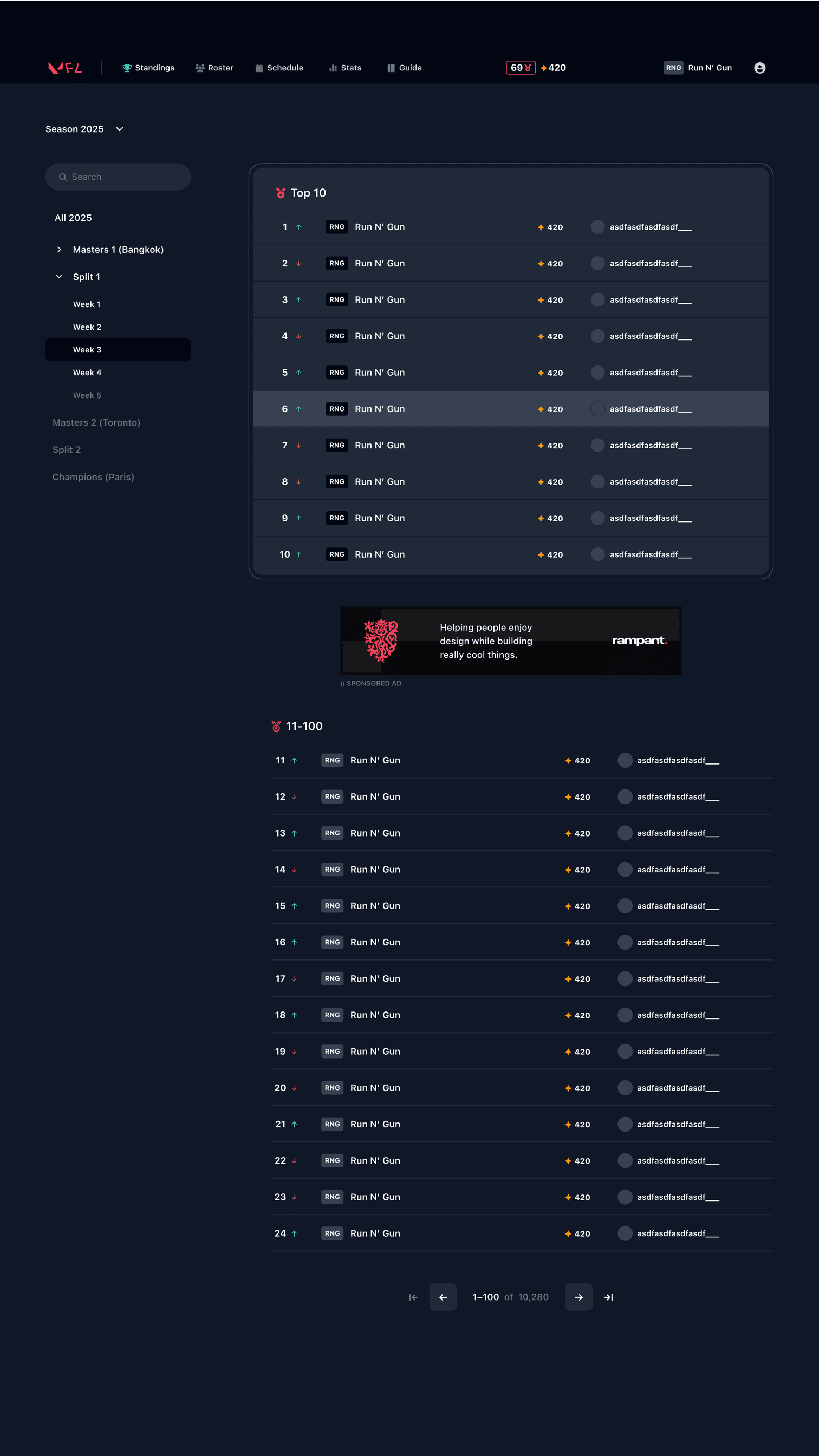
The leaderboard adds deeper sorting and gives special presence to the top 10 players
The leaderboard experience builds on the existing sorting features, while adding a special placement callout for the players in the top 10.
Code
We've continued the project with a Youtube livestream as we take our designs from ideas into code.
Oh, we also did a quick logo redesign. It's an omage to the Valorant logo without copying it. (We're not sure how we feel about it.)

We appreciate the VFL for making something that we could use as an educational opportunity. If you find esports fantasy compelling you should give it a go and support the team making it!
Go play VFL