Project
Flags of State
Reimaging eight of the worst state flags
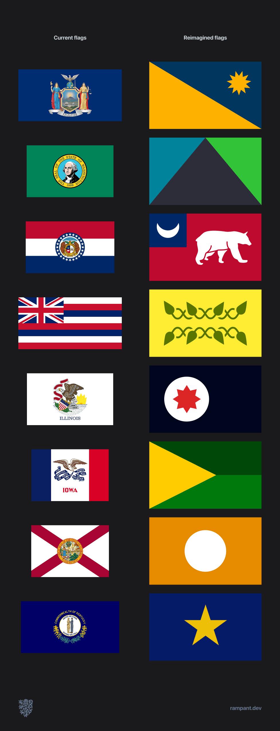
U.S. state flags suck. We redesigned a few of the worst.
Originally completed April 2024. Republished April 2025.
Spark
We've loved flags, banners, standards and emblems since we were kids. It's always fascinated us that simple combinations of colors and shapes could represent nations, ideas, histories, legacies.
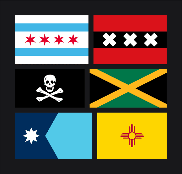
A few of our favorite flags: Chicago, Amsterdam, Jamaica, Minnesota and New Mexico.
This delight was reanimated by the recent Minnesota flag redesign. Their gorgeous work inspired us to explore what the process might look like for other states.
We identified seven of the worst U.S. State Flags and set out the task to reimagine what each could be.
Rules
Before we start, we need to create some guidelines. Flag designs are something that few get right, so let's define what makes a flag successful.
- Above all else, a flag MUST create unity for the people it represents
- It MUST be recognizable at long distances
- It SHOULD be made up of two or three colors to make it legible and easy to produce
- It SHOULD be simple enough that a child could draw it from memory
We also decided that we wanted to keep all of our flags the same shape and dimensions.
But before you hop in let's play a quick game.
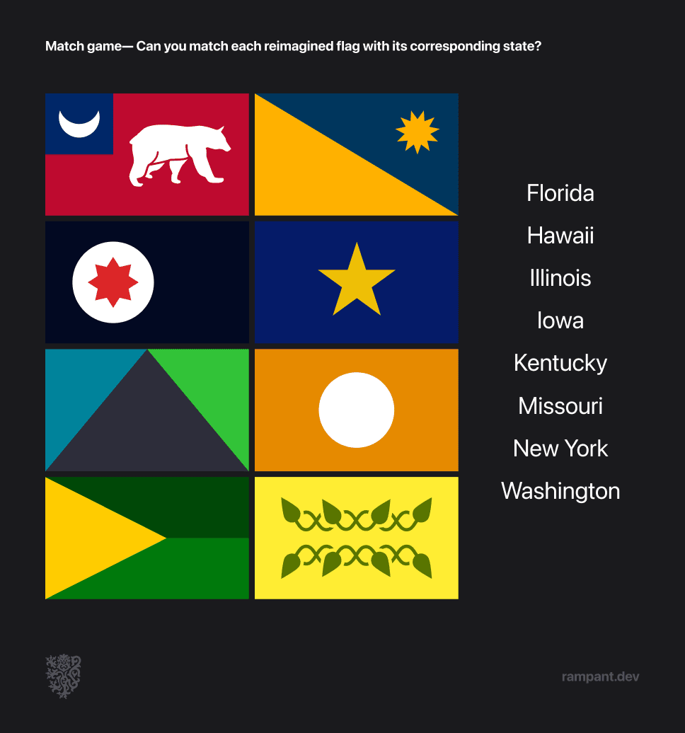
Below are our eight flag reimaginings and state names in a random order. Can you match our redesigns with their corresponding states?
New York
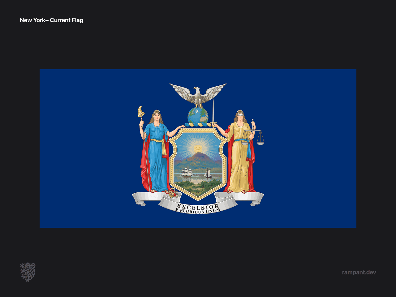
The most common flag design for U.S. States is to slap the state seal on a blue flag, which is exactly what New Yorkdid.
In the case of New York this isn't all bad. One of the things we appreciate about the Seal of New York is the layers of meaning behind it.
In reimagining New York flag we took the deep meanings behind the state seal inspiration, and translated them into an abstracted flag design that depicts the old world spirit of New York State.
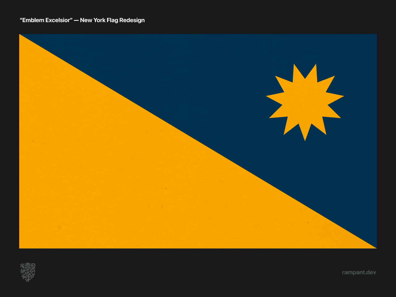
We're calling this bold reimagining "Emblem Excelsior" after the state motto Excelsior, which means "ever upward."
- Pointed sun— the sun has 11 points, as NY is the 11th state
- Truth & Justice— the blue and yellow/sunshine color represent the colors of the ladies' robes
- Excelsior— The colors are slanted from the bottom right, representing coming from the York of the old world, to the New York of the America's, and ever upwards from there.
- Sun rising—The slant also represents the edge of the mountain from which the sun is rising.
The resulting combination standard would catch eyes on any stage.
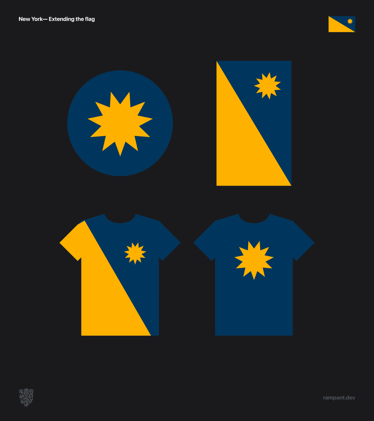
Great flags are easy to apply in other contexts. Emblem Excelsior can be adapted to a variety of contexts, including as a roundel and on apparel.
Note: when hanging vertically the sun should always be on the top right.
Washington
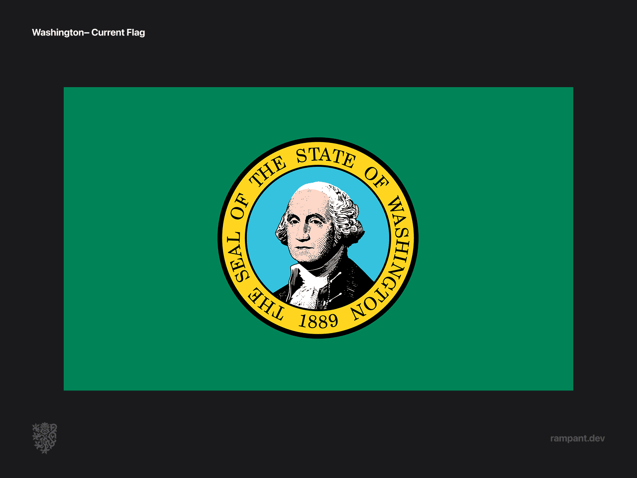
Another state seal slapped on a piece of cloth, though at least this banner is a nice green!
We can do better.
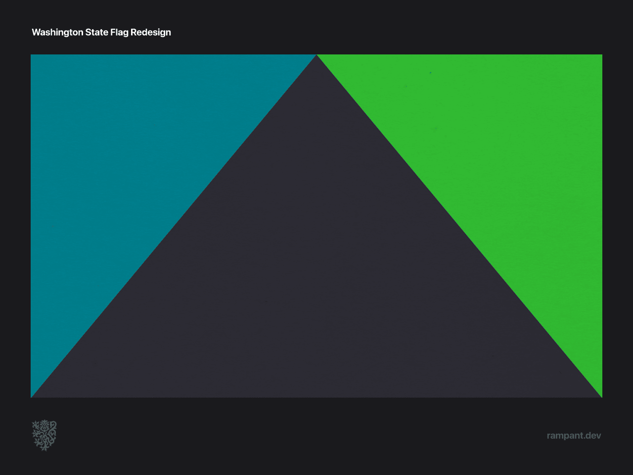
The reimagined Washington flag pushes flag traditions to the limit while still holding tightly to every rule we've established.
- Color— the blue, green and gray are inspired by the traditional art of the Kwakwakaʼwakw people, natives of the pacific northwest.
- Forms— the gray triangle in the middle pays homage to the Cascade Mountain Range that bisects the state, with a blue field representing the seaside climate and the green representing an inland ecology.
- Big "W"— the structure of the flag forms an abstract W.
The final banner is completely unique on both the national and world stage, and both holds closely to tradition while fearlessly pushing it forward.
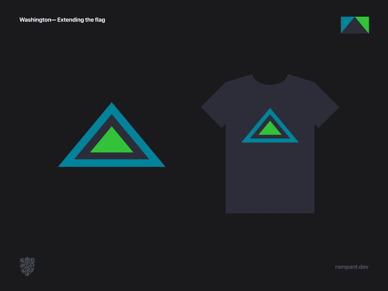
The state "roundel" is as iconic as the flag, and is easy to imagine produced as pins, stickers and magnets collected widely by visitors and citizens alike.
Missouri
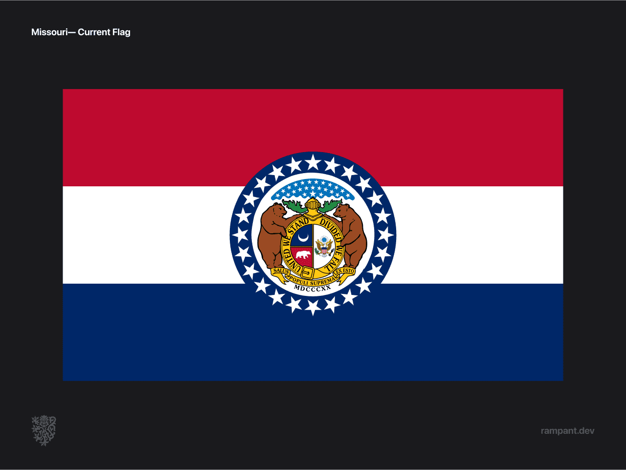
Seal on red white and blue. But there's still some great opportunities to draw from!
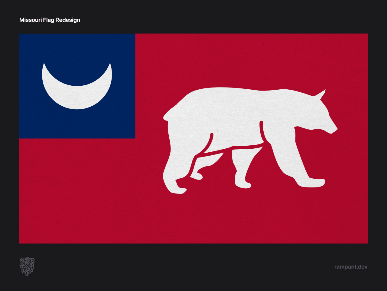
Our reimagined Missouri flag capitalizes on two completely unique elements on the seal, creating a distinct banner while keeping all the meaning behind the state seal:
- Crescent— in traditional heraldry the crescent represents the second son, and Missouri was the second territory from The Louisiana Purchase to be recognized as a state.
- Bear— represents strength and courage, and is looking forward towards surmounting difficulties.
- Red— shows hardiness and valor.
- Blue— signifies vigilance, perseverance and justice.
- White— purity and innocence.
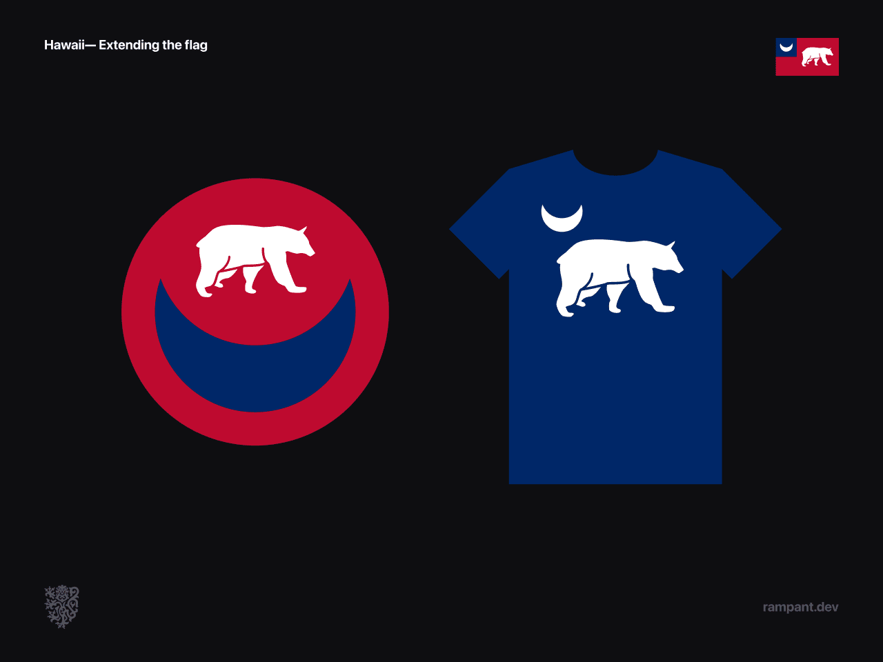
The distinct shapes and strong colors create a unique presences among U.S. heraldry.
Hawaiʻi
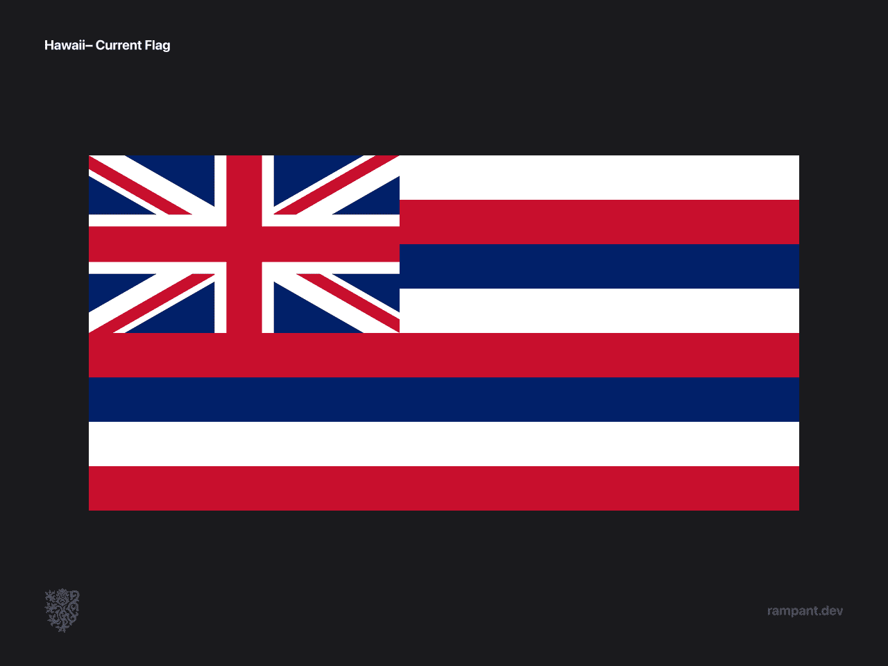
Hawaii is the only flag on our list that isn't a state seal slapped onto some cloth.
Though in this case that might have been better.
The Hawaii seal at least put in some effort to honoring the heritage of the Hawaiʻian people.
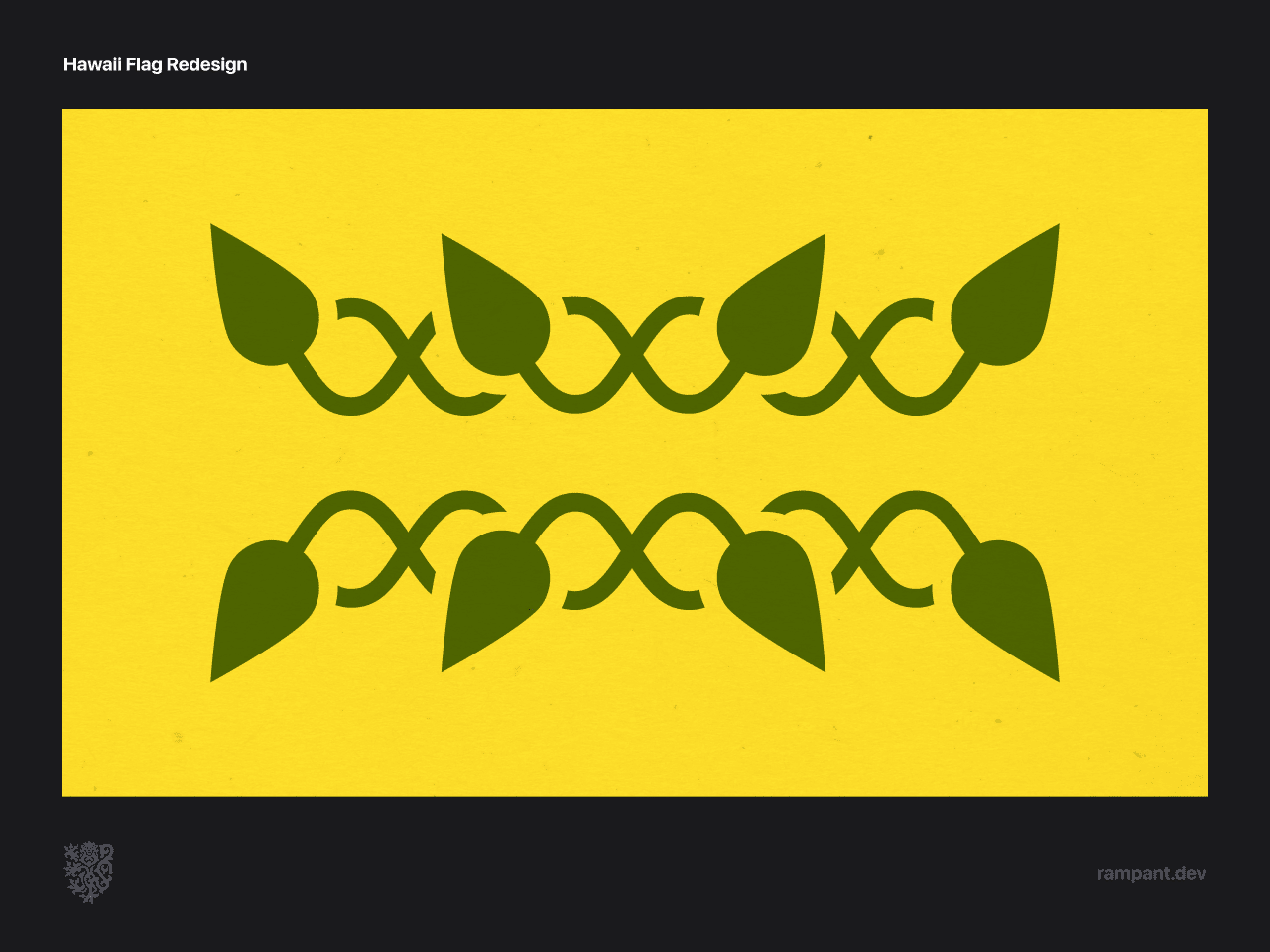
The best way to design a flag for Hawaii would be to involve the native population in it's creating. Since we don't have an opportunity to do that for this project we are going to build off of what we know, while keeping in mind that this is meant to push the boundaries of what's possible without defining it.
- Tarot leaves— the tarot leaves have special significance among the Hawaiʻi people, and represent the Kingdom of Hawaiʻi motto "The life of the land perpetuated in righteousness."
- Crowns— the leaves are woven together into the shape of crowns, reminding the world that the Kingdom of Hawaiʻi was internationally recognized as a sovereign kingdom.
- Colors— the green represents harmony with the islands, and the gold represents the royal rights of the Hawaiʻian people.
- Exclusive— the hawaiian flag joins a very small club of flags that contain no red, white or blue.
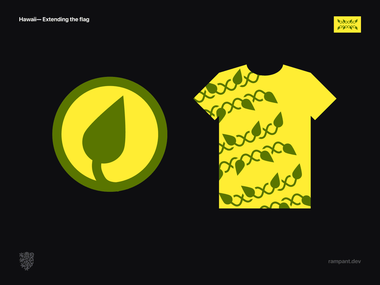
Creating the right flag for Hawaii would need to come from it's people, but this reimagining shows what could be possible.
Illinois
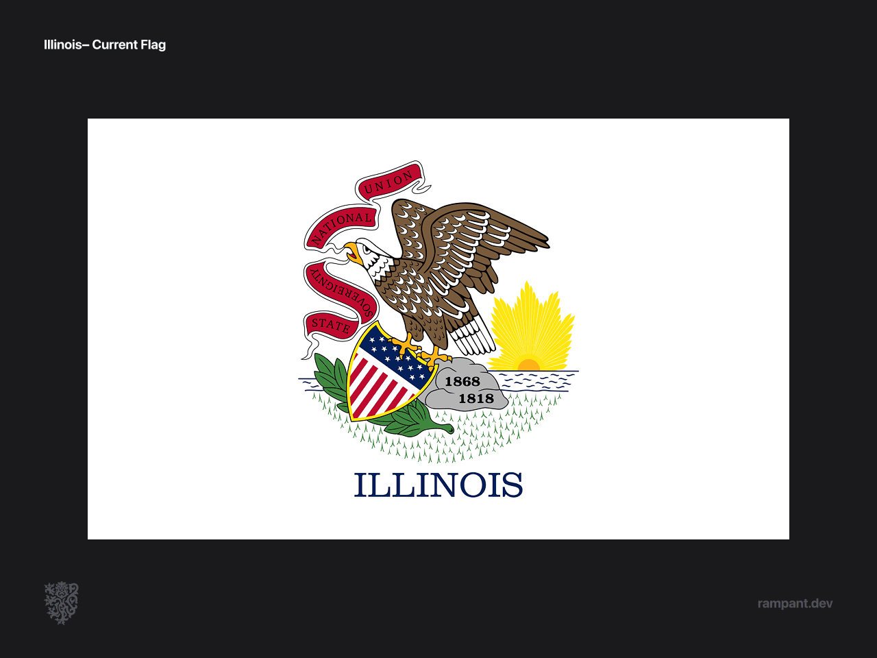
Illinois. Our home state, and probably the worst offender of state seal slapped on a flag.
This flag was the most difficult for us to design. We created over 100 iterations, with common themes including prairie, sky, sun, crossroads, heart of america, and more.
What they all lacked was a sense of strength and boldness that is woven into the culture of the Land of Lincoln.
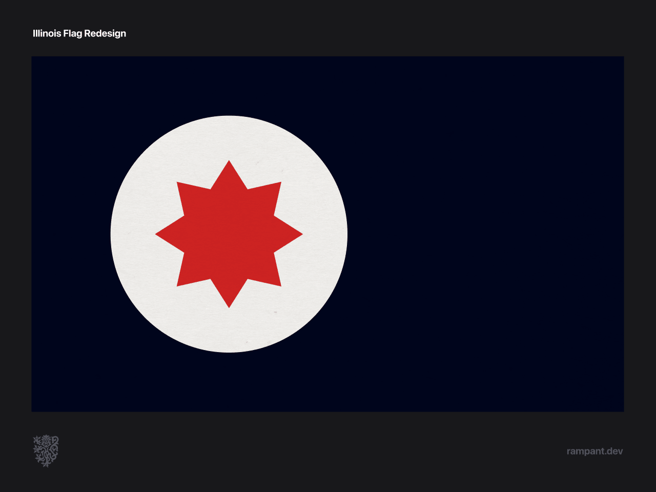
The reimagined Illinois flag takes inspiration from the spirit of Illinois.
- Compass/sun– the starlike emblem doubles as a compass and a sun.
- Compass– represents Illinois as the central crossroads of America.
- Crimson sun– signifies boldness, and the first part of the motto, "State sovereignty."
- Field of the deepest blue denotes depth of loyalty and hard-working strength.
- Red/white/blue– speaks to the second part of the motto, "National union."
The reimagined Illinois flag is nothing if not bold.
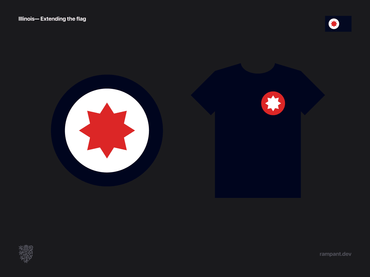
When creating the Illinois banner we wanted to make sure we avoided any resemblance to the Flag of Chicago, and make sure that Illinois had a sovereign presence.
While there are similar elements, the differences in the application are stark.
Iowa
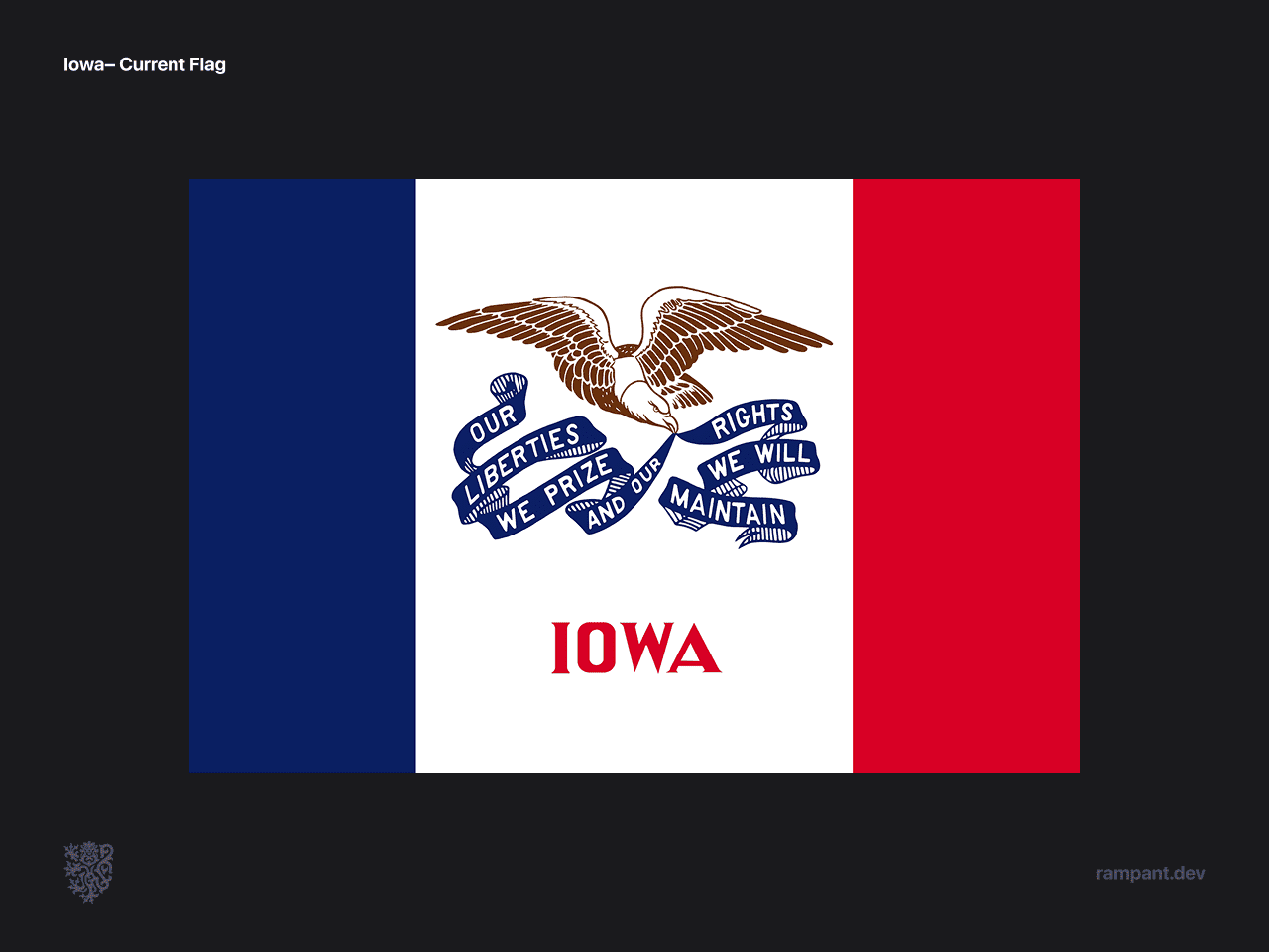
At first glance the flag of Iowa is reminiscent of the French tricolour, but the white band in the middle was widened to make space for...say it with us...the state seal.
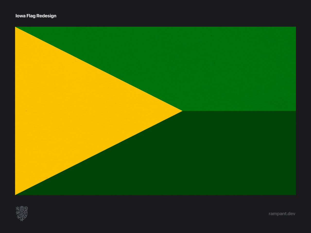
As a midwestern company, we have had many friends from Iowa over the years. We were consistently inspired by their hard work and generosity.
Those traits inspired gold to represent an optimism and the sun giving life to the lands. Tnd greens that represented the connections between people and land. The green is split into two shades, to represent the bisected ecolology of the state.
But let's face it, what we ended up with was an ear of corn, and we're alright with that.
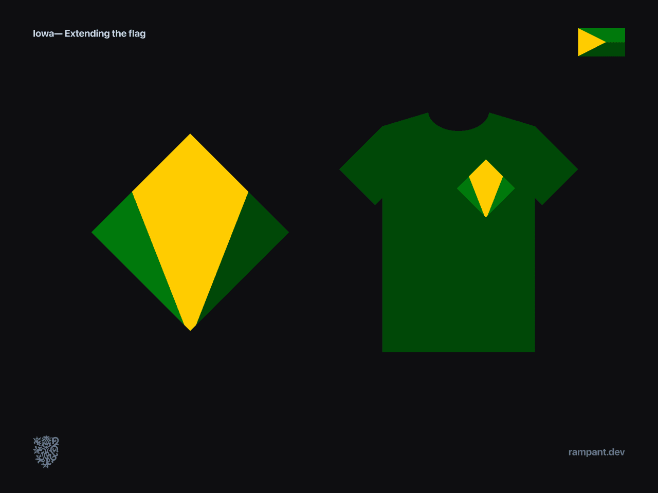
Similar to the WA roundel, the Iowa roundel took on a unique shape which was an aspect that we particularly enjoyed.
Florida
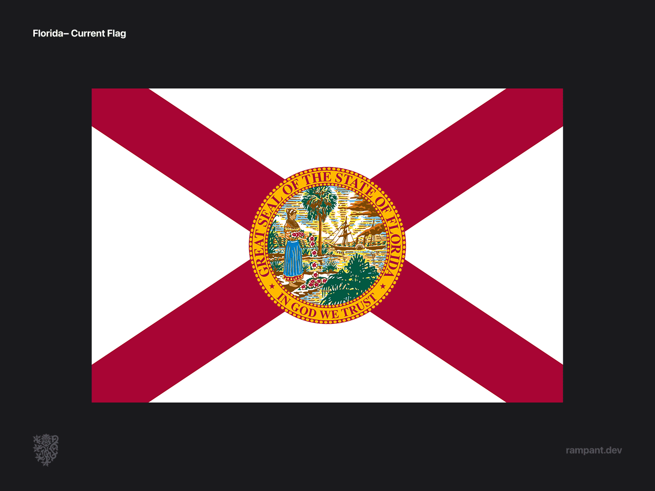
Florida's banner is an omagé to standards born by the spanish navies of the 19th century. But guess what they did? You guessed it! They added a state seal right in the middle.
Nothing left to say about that.
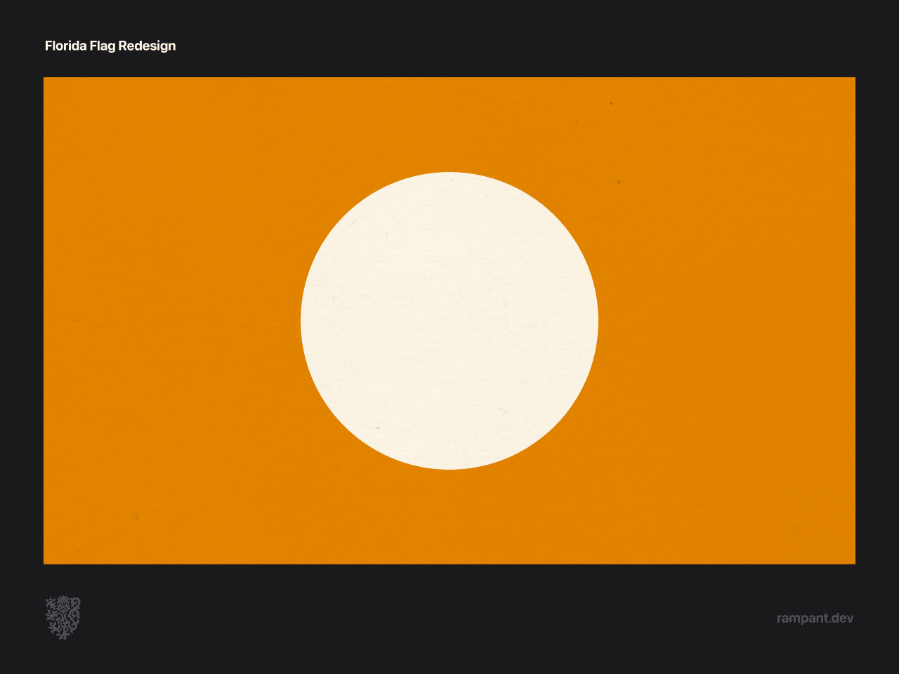
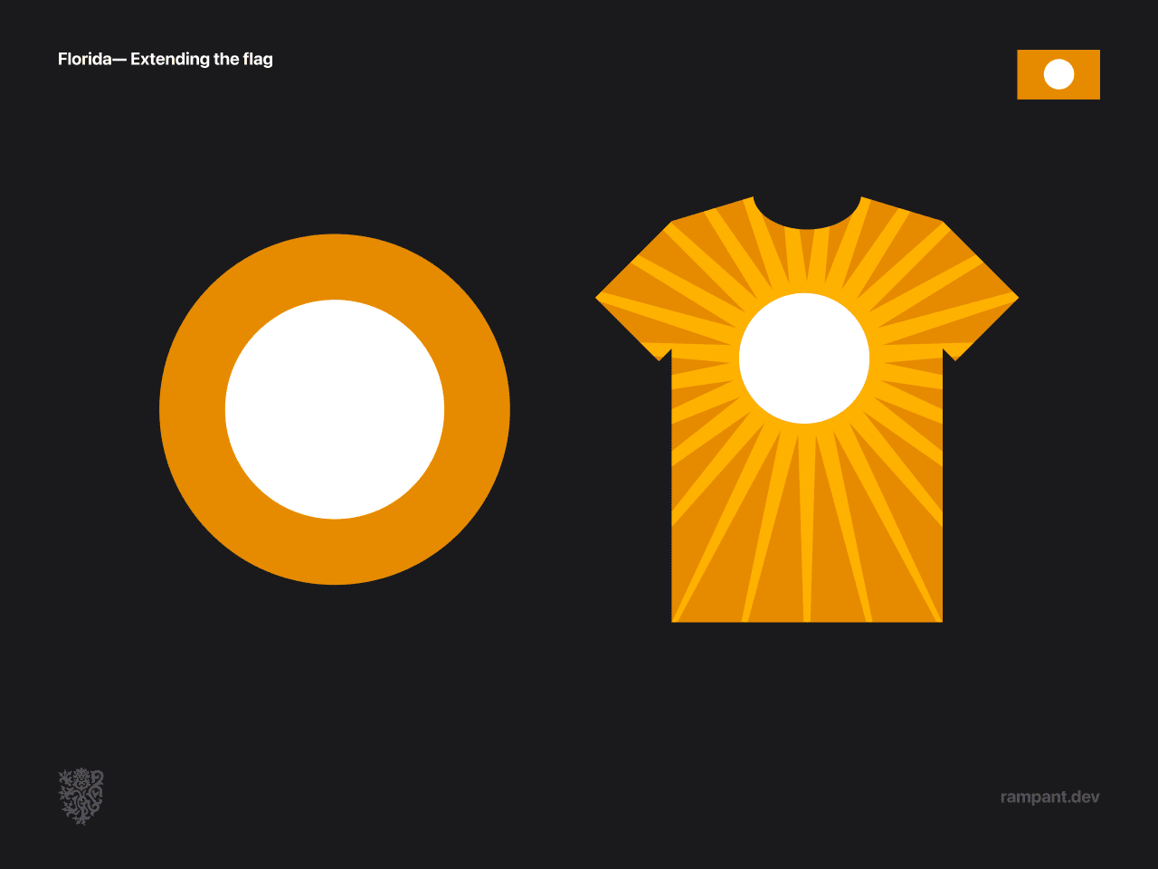
Florida's reimagines flag is guided by their identity as "The Sunshine State."
Most people will quickly point the resemblance to Japan's flag. This is a great comparision; Japan's flag is an iconic example of traditional flag design and has great elements that many would be smart to utilize.
Florida's updated banner is a brave reinterpretation that would stand out among any lineup of flags, instantly reconizeable to all as to who it represents.
Kentucky
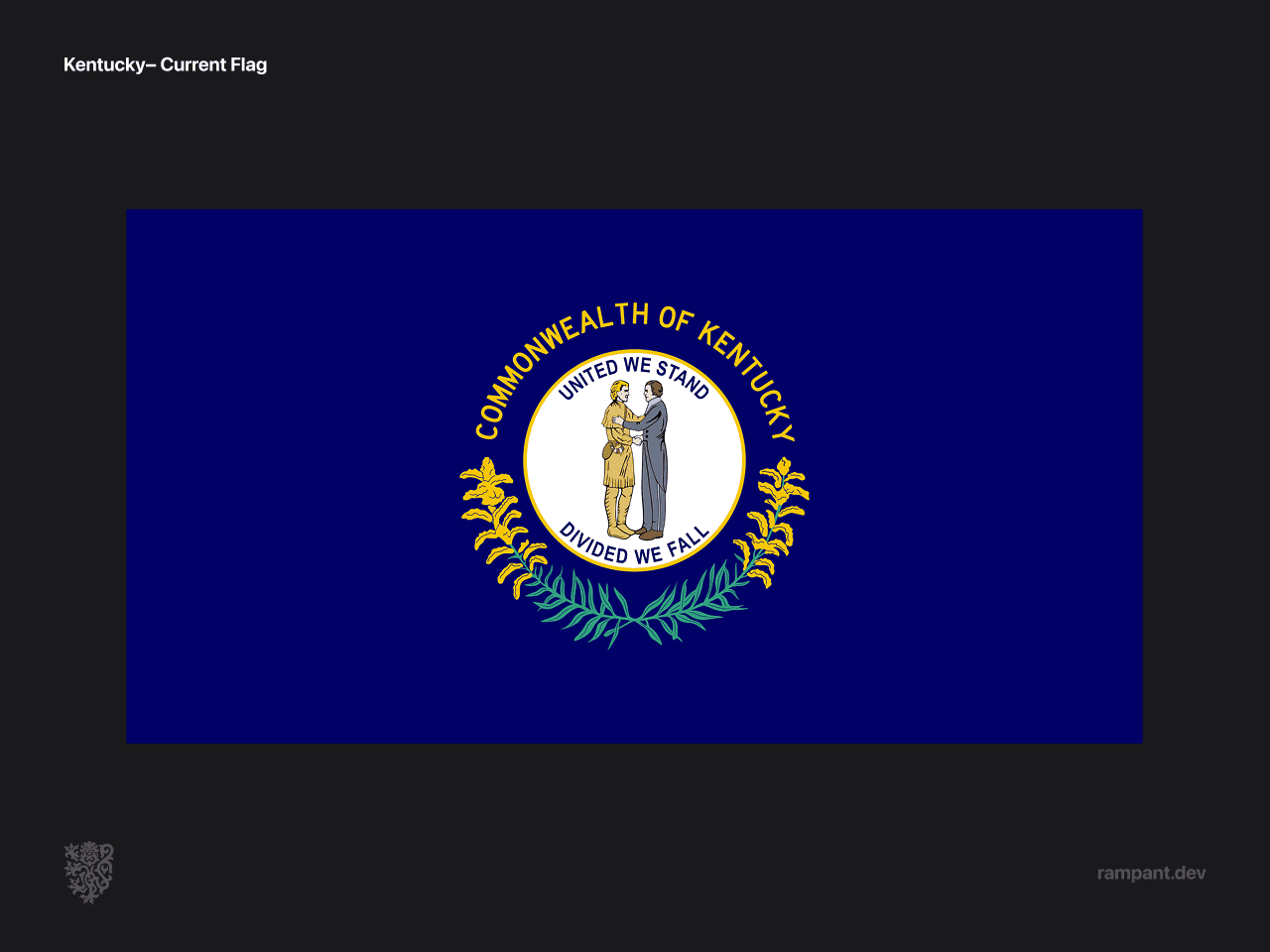
Seal. Blue field. Omg.
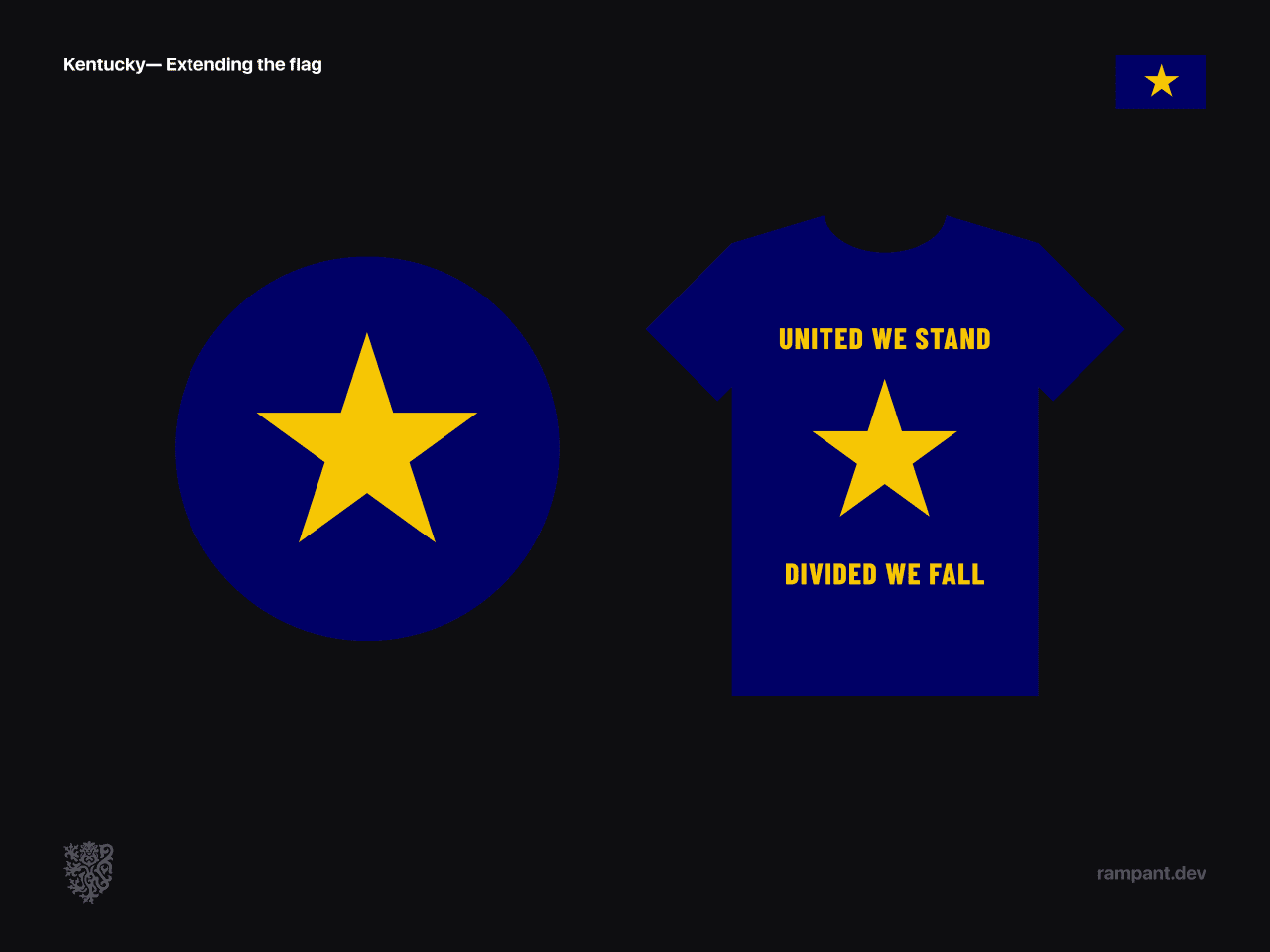
Thankfully, the Kentucky seal tells a great story of declaring unity; in the center a statesmen and a frontiersmen grasp hands, braced by the words "United we stand, divided we fall."
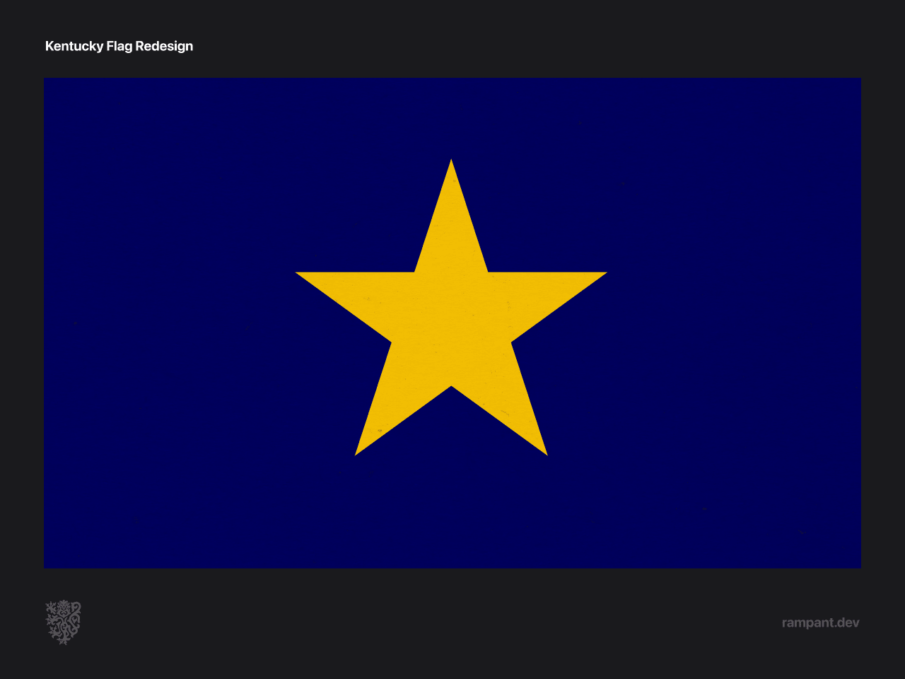
The reimagined Kentucky flag builds off the compelling meaning behind the state seal.
- Star— the single star represents unity. It has five points to represent the hands in a handshake, as depicted on the state seal.
- Gold— represents the Kentucky spirit of independence, her identity as a sovereign Commonwealth.
- Blue— represents the unity of the people of the state, and is an omaĝe to the unique bluegrass found there.
The resulting standard is strong and direct, and would be iconic among the flags of any time period.
Learnings
As people who have loved flags and sigils from a young age this project was a joy, and left us with a fair number of takeaways.
- We were most often inspired by a countries land and ecosystems. What unites all the people of a state is the land they share, and that often came through.
- Unity was a key factor in almost every design, which is natural when a key purpose of a flag is to bring people together.
- Good use of the rule of thirds is the biggest visual factor in designing a flag.
- Stars and suns were the easiest symbols to work with, partly because they are simple enough to be obvious, partly because they don’t have the baggage that a lot of other symbols do, and partly because they are universal symbols that resonate with everyone.
- Red was the toughest color to work with, which felt due to the baggage associated with crimson banners: socialism, nazism, communism, confederacy. While I think that from a pure design perspective red is a gorgeous color to work with, keeping the associations in mind is helpful.
With that, lets take one final look at our new standards. Do you have a favorite? What are aspects you enjoy, and what would you improve on?
